
As a software developer or engineer, you will find yourself needing to give a presentation once in a while. Even if your presentation slides are packed with useful information it does not help your audience if it is difficult to digest. Therefore, to have an effective set of presentation slides you need to balance between flow and simplicity along with avoiding clutter.
Here are some important terms to understand:
- flow: the ability for an audience to follow visual aids
- simplicity: the aspect of a visual aid to be grasped quickly
- clutter: too much information on a visual aid
The tips I am going to cover will be the following:
- outlines
- slide structure
- fonts
- color
- background
- graphs
- spelling and grammar
- conclusion
- questions
Outlines
You should make your second slide an outline of your presentation. Follow the order on your outline for the rest of the presentation to avoid breaking flow. On the outline slide, you should only place the main points. For example, use the titles of each slide/topic as main points.
Here is an example of a good outline slide

Slide Structure
Good slide structure consists of:
- using 1 to 2 slides per minute
- write in point form instead of complete sentences
- include 4 to 5 points per slide
- avoids wordiness (use keywords and phrases instead)
- show one point at a time
- Helps your audience concentrate on what you are saying
- Prevents the audience from reading ahead or going ahead of you
- Helps you keep your presentation focused
Bad slide structure consists of:
- Long sentences (one bullet point might be a paragraph)
- This causes your audience to spend time reading the paragraph instead of listening to you.
- Do not use distracting animations
- Do not go overboard with animations
- Be consistent with animations. Do not have randomized animations for each slide since it is distracting your audiences.
Fonts
Some good practices for fonts are:
- Using at least an 18-point font.
- Use different size fonts for the main points and secondary points. For example, title font is 36-point, main point font is 24-point, and secondary point font is 20-points.
- Use a standard font such as Times New Roman or Arial. You do not want to be distracting your audience with fancy fonts.
Color
Some good practices for colors are:
- Using a color of font that contrasts sharply with the background. This allows the audience to easily read the slide. An example would be white font on a blue background.
- Using color to reinforce the logic of your structure. For example light blue title and dark blue text.
- Using color to emphasize a point. You should only do this occasionally and always use a complementary color for emphasis. For example, if you are using blue fonts then for emphasis use orange. Below is a color wheel showing complementary colors.

- Ensure font colors are in contrast to the background.
- Using bright color associates with excitement. While neutral colors are professional.
- Using no more than 3 to 4 colors per slide.
Background
Some good practices for background are:
- Using backgrounds that are attractive but simple. This attracts the audience but not distract them.
- Using light or dark colored backgrounds. Make sure your font contrast with the background.
- Using the same background consistently throughout your presentation.
Graphs
Some good practices with using graphs in your presentation:
- Value using graphs over just charts and words. Data in graphs is easier to comprehend and retain than just raw data. It is also easier to visualize in graph form.
- Make sure you label and title your graphs.
Some bad practices you should avoid with graphs in your presentation:
- Using minor grid lines that are unnecessary.
- Using small font.
- Using colors that does not mix or is illogical.
- Forgetting to give a title.
- Using shading, which is distracting to your audience.
- Using dark graphics on a dark background.
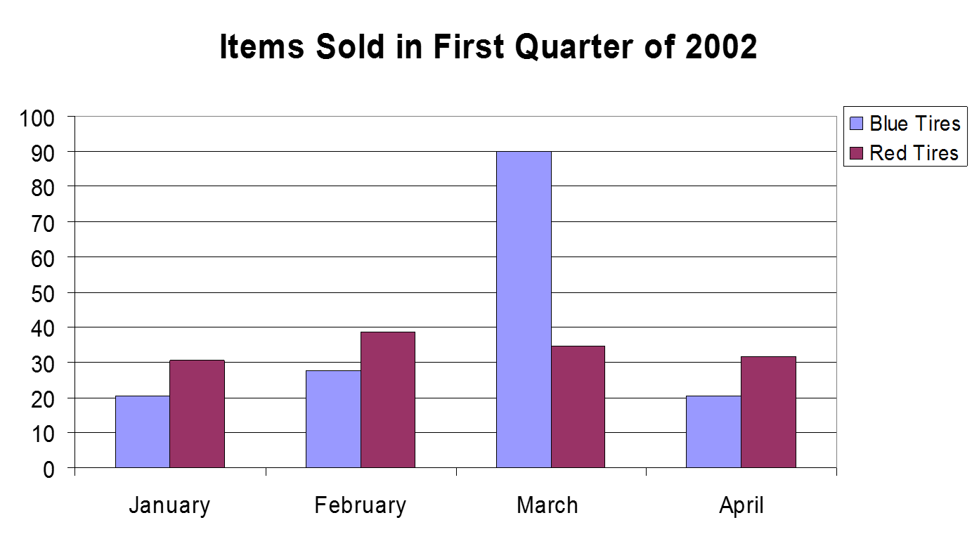
Here is a side-by-side comparison between a good and bad graph. Can you identify which is the good one?

Spelling and Grammar
Make sure you proofread your presentation and have another person look it over. Having spelling mistakes, repeated words or grammatical errors makes you come off less professional to your audience. The last thing you want is to have some spelling or grammar mistakes to make you look bad.
Conclusion
Use an effective and strong closing since your audience is likely to remember your last words. You should include a conclusion slide and use it to:
- Summarize the main points of your presentation.
- Suggest future avenues of research or the next phase in the process.
Questions
End your presentation with a simple question slide. A question slide can accomplish various things such as:
- Inviting your audience to ask questions.
- Providing a visual aid during question period.
- Avoid ending a presentation abruptly.
Here is an example of a simple question slide:

I hope these tips will help some of you out there create an awesome presentation. If you find these tips helpful, share with someone else that can benefit from them. If you want to get in touch, you can follow me on twitter.